Training exercise
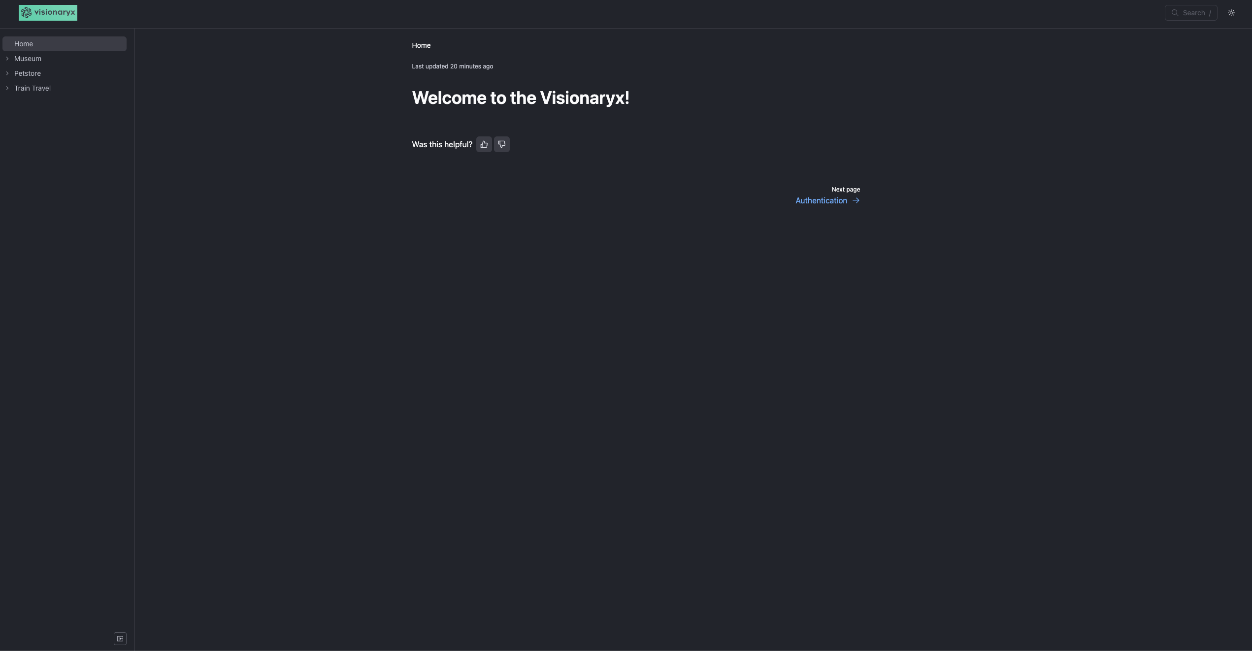
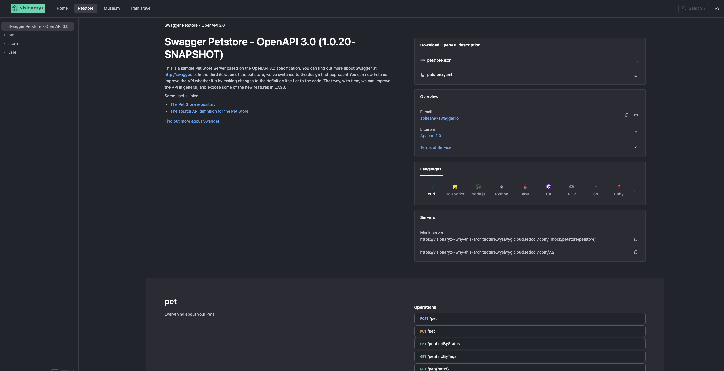
We're working on a website that integrates three APIs. During our evaluation, we considered three different layouts for presenting the APIs: a single sidebar, a navigation bar (navbar), and a catalog with tiles. Here's what we found:
- The single sidebar felt too crowded.
- The navbar was user-friendly and made switching between APIs easy.
- The catalog with tiles seemed excessive and unclear for just three APIs.
However, one issue with the navbar is that it doesn't highlight the active API on the museum guide pages, which can be confusing for users.